 Finally. It's done. :D
Wednesday, November 19, 2008
Thursday, November 13, 2008
Map of the Week #9
Wednesday, November 12, 2008
Lab 9
 Between the web version and the paper copy of this map, I can only really see two differences. For one, the background color is much lighter online than it is on the paper, which isn't really bad, just unexpected. Also, the second and third classes are much closer together in appearance on paper than they are on the computer. They are still distinguishable, but if I were going to do it over again, I would probably move the third class to be a bit darker.
Monday, November 10, 2008
Lab 8
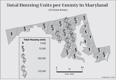
 Tada! Okay, so I know those don't exactly look like houses, but I figure, more homes, more money... right? It doesn't necessarily mean that people there have more money, but that's where more money is being spent. ... Come to think of it, I'd be interested to see a comparison dataset for total housing units per county and total value of housing units per county (or something to that effect).
Saturday, November 8, 2008
Map of the Week #8
Monday, November 3, 2008
Subscribe to:
Comments (Atom)


 I think this is a pretty neat proportional symbol map, especially considering the recent gas-price debacle.