Amen Clinics
SPECT Scanning
Brain Scans from Amen Clinics
National Geographic Interactive Brain Map
Health Professional Shortage Area (HPSA)

 Between the web version and the paper copy of this map, I can only really see two differences. For one, the background color is much lighter online than it is on the paper, which isn't really bad, just unexpected. Also, the second and third classes are much closer together in appearance on paper than they are on the computer. They are still distinguishable, but if I were going to do it over again, I would probably move the third class to be a bit darker.
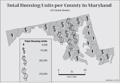
 Tada! Okay, so I know those don't exactly look like houses, but I figure, more homes, more money... right? It doesn't necessarily mean that people there have more money, but that's where more money is being spent. ... Come to think of it, I'd be interested to see a comparison dataset for total housing units per county and total value of housing units per county (or something to that effect).


Okay, I think this map projection is pretty cool. It's called the Dymaxion World Map and it was developed by Buckminster Fuller in the 1940s. I like it because you can appreciate the relationship of the continents to one another in a different way than a lot of traditional projections allow. Also, it shows everything kind of crowded on one side of the globe - when you look at it closer you realize that's because of the Pacific Ocean taking up the other side. Also, these maps can be folded up to make a somewhat globe-like figure with all the correct geographic placement.
 Hey, sorry this one is a bit late... This is from the US Census Bureau. It is a choropleth map showing the percent of the population in each congressional district that identifies itself as Asian and/or Pacific Islanders. I particularly liked this map of the four "minority population" maps because of the relatively even distribution. The other maps had very identifiable clusters, whereas this map seems to indicate that the Asian and Pacific Islander peoples are well integrated into America.